Our first project is to design a logo for a pretend client. We had three options to choose from, and I picked the online ice cream company, because I love ice cream! We have certain parameters given to us by the “client.” Here are my initial thoughts on the perspective design:
My Inspiration: There’s something nostalgic about ice cream. Somehow this creamy comfort food brings out the child in all of us. Kids old and young can be found licking rainbow sprinkles off their chocolate-vanilla twists. Because of this, the emphasis of the logo must be the ice cream. In terms of color, the “client” is limiting us to just three, so incorporating the trio of colors found in Neapolitan ice cream (pink, cream and light brown) seems appropriate.
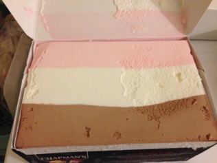
The light, pastel colors also give it an old-fashioned feel, like those SomeEcards that are floating around Facebook.

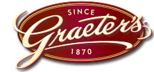
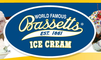
I found a number of ice cream companies with oval logos and script font. I’d like to continue the old-fashion theme with a similar font, like brush script or palace script. However, the client would like a rectangular-shaped logo.
In contrast to the old-fashioned theme, the consumer will order their ice cream online for home delivery. The “client” wanted to incorporate a shipping truck and once again nostalgia kicked in and I thought of the ice cream trucks from my childhood.

Another aspect the client requested in the logo is a box. A couple ice cream companies online show their insulated shipping container. However, for the logo design, perhaps a regular cardboard box may be better.

