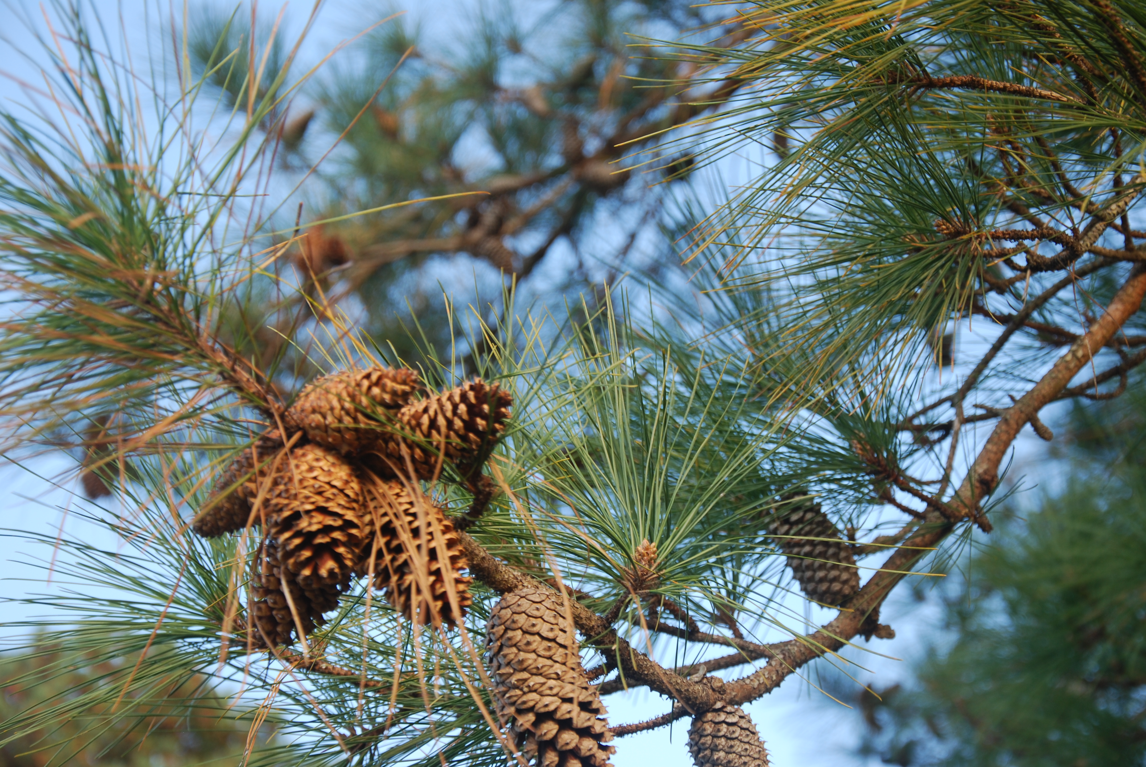
Filters & Layers
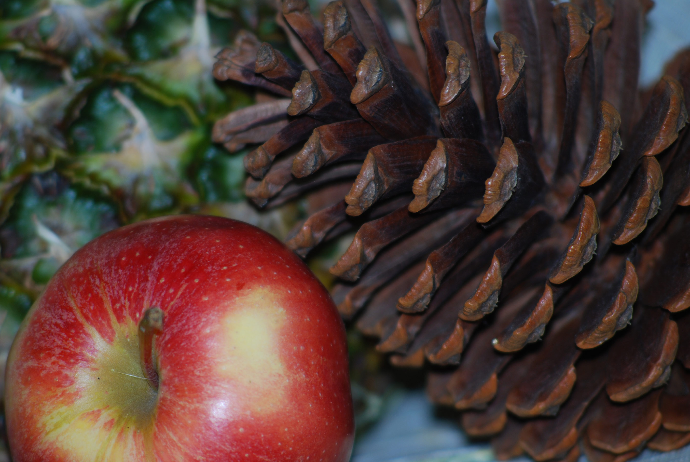
The Original:

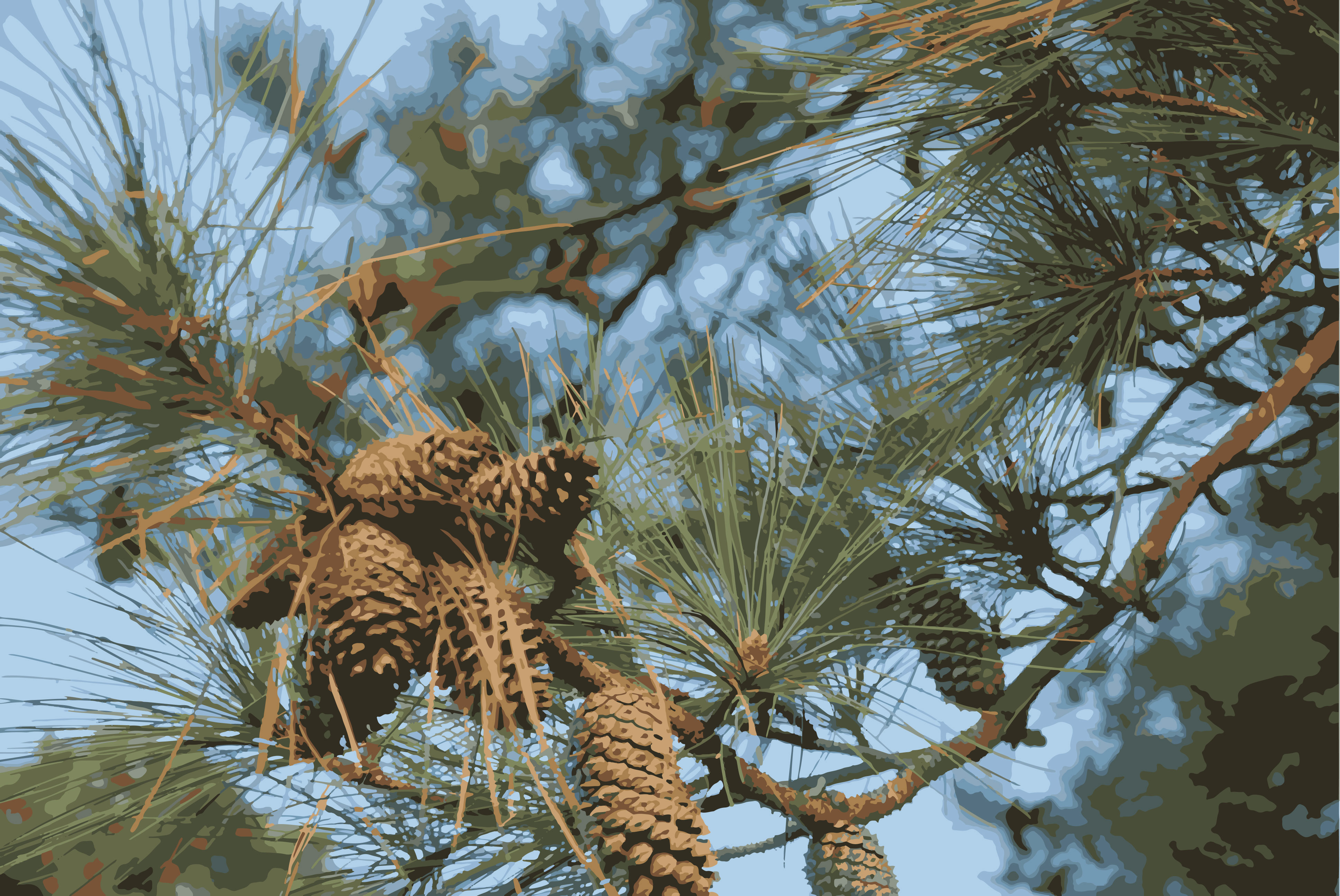
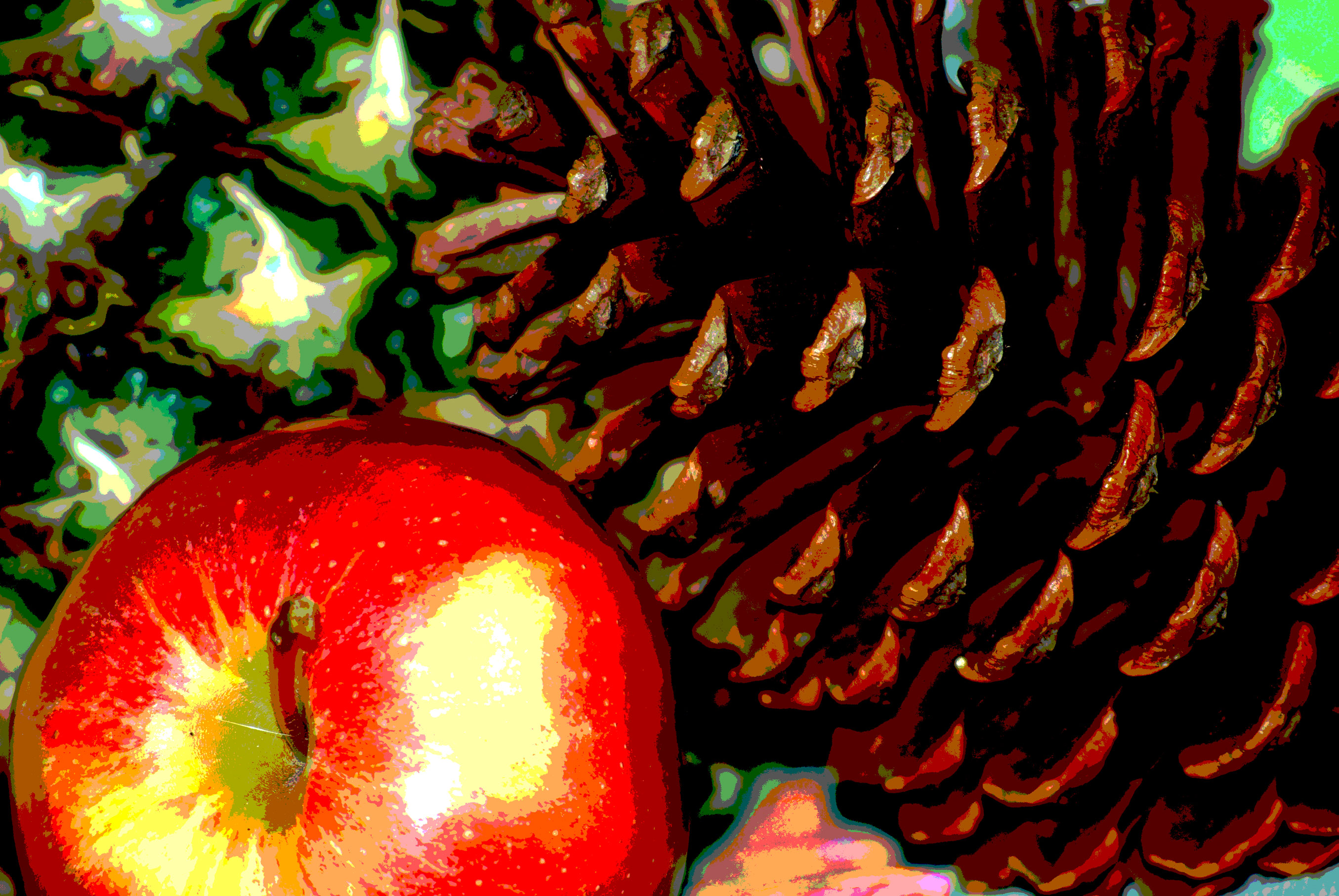
 Version 1: I adjusted the color balance (midtones and shadow)s to play with the mood of the photo. Then I adjusted the exposure and applied the posterize filter and then adjusted the exposure further to better highlight the pinecone and add more depth to the photo. I like the posterize filter. It gives the image a painted look, almost realistic, but not quite.
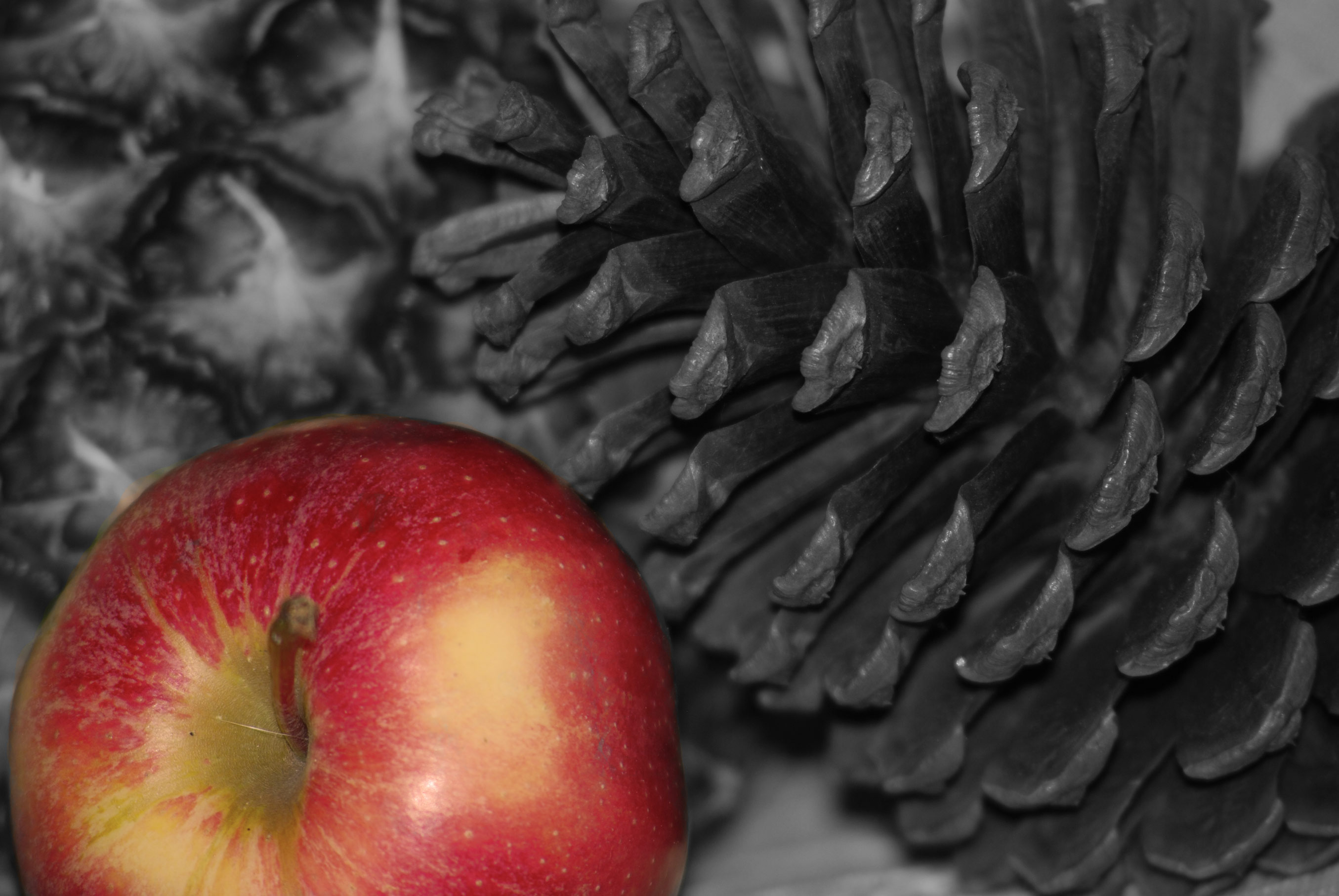
Version 2: Applied a warming filter (85) at 75%. Then applied at black and white filter. Then used the brush tool to paint the apple black , thus erasing the black and white filter on the apple and highlighting it and its rich color. I like that this makes the pinecone part of the background along with the pineapple in the far background and emphasizes the apple. The pinecone in the original has more visual interest, but the apple takes center stage in this version.
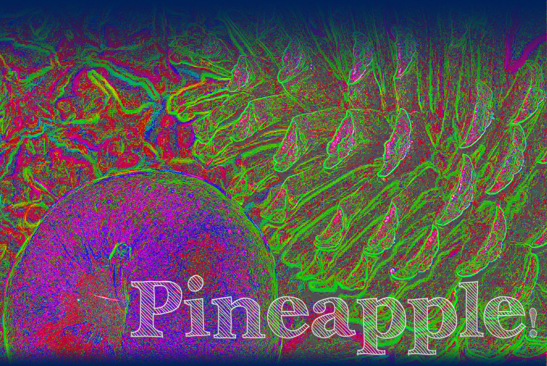
Version 3: First I used the find edges filter and then adjusted hue and saturation, to bring out colors. Next I increased the vibrance and applied the invert filter. I added rectangles at the top and bottom with a gradient of blue that fades into the picture, providing a sort of frame. Then added a layer of text: Pineapple (get it? Apple plus pinecone equals pineapple! Kind of). The colors and abstractness of this image are fun and could become a background for use in another application or project.