I used a star theme to keep a similar element to my 25 boxes (design in Illustrator):
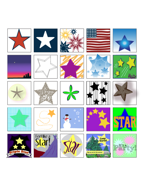
I used a star theme to keep a similar element to my 25 boxes (design in Illustrator):
For our second class assignment, we were to chose one of three clients who needed a poster designed. One of the options was a poster for Shakespeare in the Park. I decided to focus on Romeo & Juliet for my Shakespeare in the Park poster (because it is the play I know best). The first idea that came to mind was the poster in our text book (figure 2-4, p. 23). I like the contrast, which also reflects the theme in R&J of light and dark. Another theme in much of Shakespeare is that things are not always what they seem, and this is reflected in the hidden images of the dagger and heart between the couple.

I like the combination of initials over the heart in the poster below and how the letters are not only connected, but the arm of the R is really a dagger (again, things are not always what they seem).

I was thinking about the star-crossed lovers bit and imagined a starry night, kind of like the poster below, but with stars instead of windows.

I like the idea of using a lit balcony as an isolated image in the middle of the page to determine the weight of the image (like figure 9-17 in our textbook).
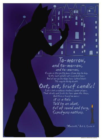
But I also like the use of text as an image in the poster below to include some famous quotes from the play. Again, I like the high contrast between the text and the background. I also like the script typeface, which unites the individual words into one blended image.

However, considering my novice skills with Illustrator, a text-driven poster may be what I’m able to create at this point:
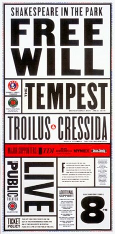
This poster seems to use the same type family and uses different sized text to emphasize and unite the information.
A poster of Shakespeare in the Park needs to convey the following information to the public: event title, play name, location, time, date, cost. The image used needs to help grab the viewer’s attention.
Here are some initial ideas/sketches:

Images Cited:
http://media-cache-cd0.pinimg.com/736x/a5/06/3e/a5063eb604ade096ed1ef76536ec0b14.jpg
http://payload.cargocollective.com/1/4/147536/1974360/rj%20cargo%20lg.jpg
http://imgc.allpostersimages.com/images/P-473-488-90/76/7605/VU2F300Z/posters/sonnet-18.jpg
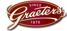
Our first project is to design a logo for a pretend client. We had three options to choose from, and I picked the online ice cream company, because I love ice cream! We have certain parameters given to us by the “client.” Here are my initial thoughts on the perspective design:
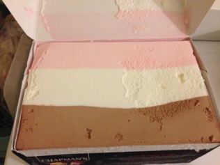
My Inspiration: There’s something nostalgic about ice cream. Somehow this creamy comfort food brings out the child in all of us. Kids old and young can be found licking rainbow sprinkles off their chocolate-vanilla twists. Because of this, the emphasis of the logo must be the ice cream. In terms of color, the “client” is limiting us to just three, so incorporating the trio of colors found in Neapolitan ice cream (pink, cream and light brown) seems appropriate.
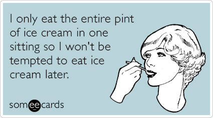
The light, pastel colors also give it an old-fashioned feel, like those SomeEcards that are floating around Facebook.
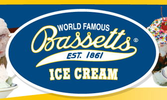
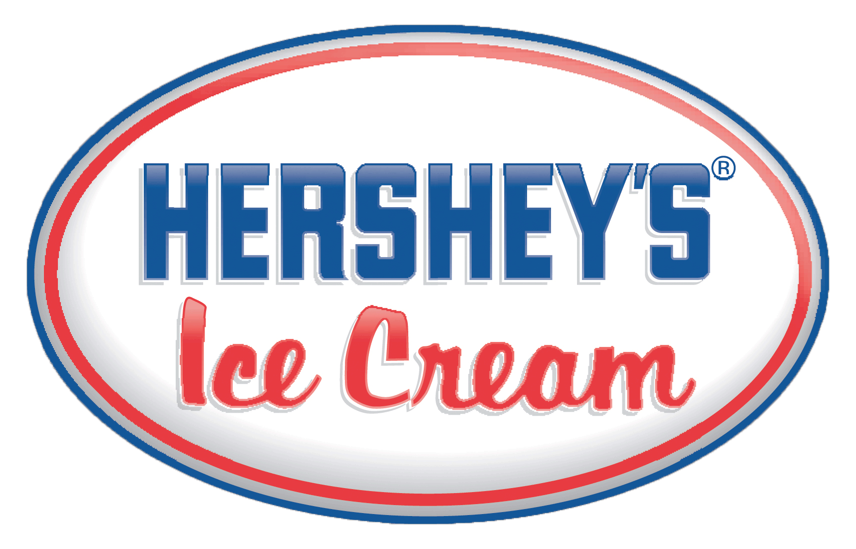
I found a number of ice cream companies with oval logos and script font. I’d like to continue the old-fashion theme with a similar font, like brush script or palace script. However, the client would like a rectangular-shaped logo.
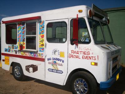
In contrast to the old-fashioned theme, the consumer will order their ice cream online for home delivery. The “client” wanted to incorporate a shipping truck and once again nostalgia kicked in and I thought of the ice cream trucks from my childhood.
Another aspect the client requested in the logo is a box. A couple ice cream companies online show their insulated shipping container. However, for the logo design, perhaps a regular cardboard box may be better.


