There are different color schemes used for print and web usages.
CMYK (for print) and RGB (for web)

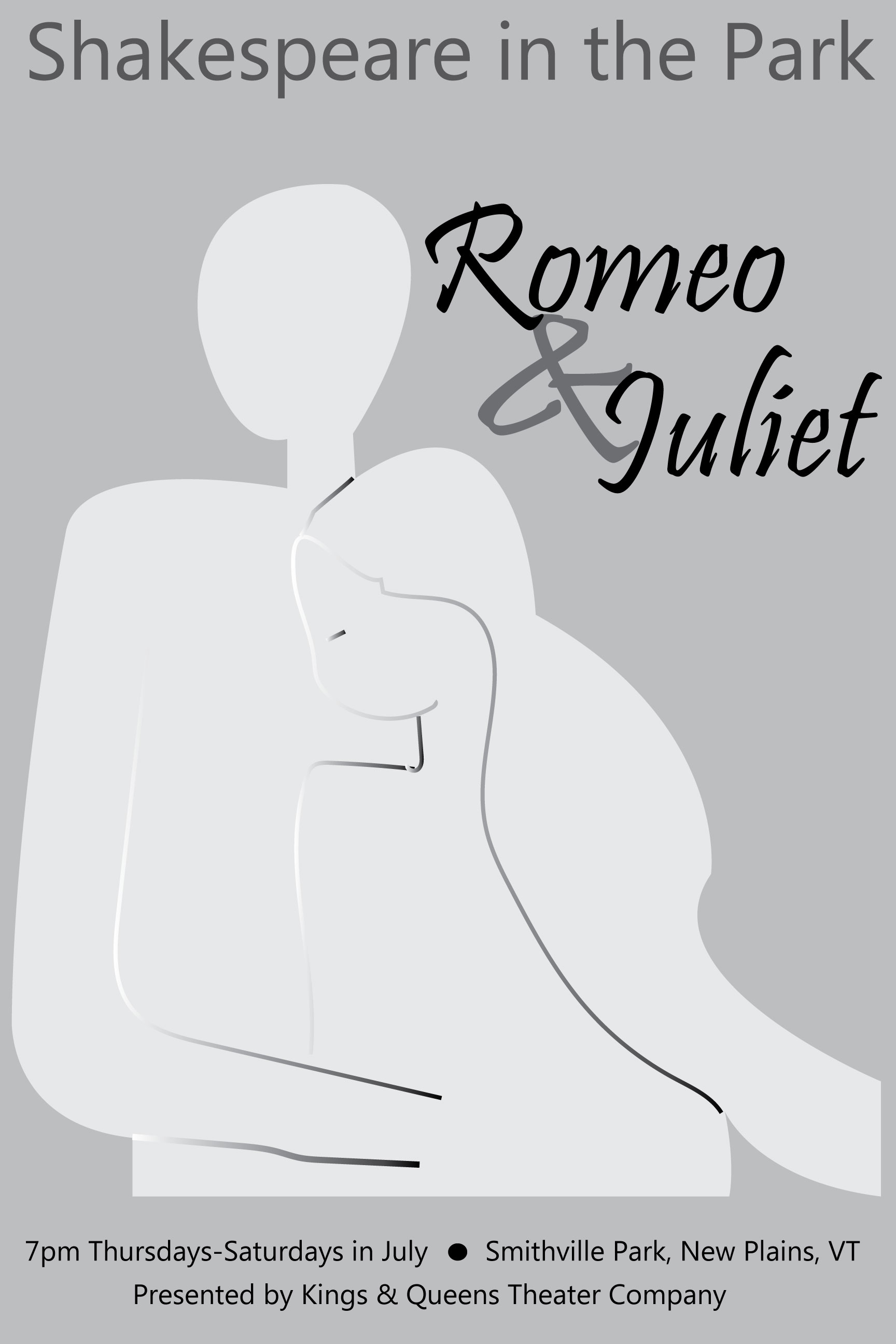
Can you see the difference when the colors (RGB) on the right are converted to CMYK (on the left)?
There are different color schemes used for print and web usages.
CMYK (for print) and RGB (for web)
Can you see the difference when the colors (RGB) on the right are converted to CMYK (on the left)?
It was difficult deciding which sketch to make into my final poster. I decided to go with the silhouettes, mostly because I wanted to practice using the pen tool. I like the light and dark and the subtly of the people. I originally did not have any red, but the professor suggested using more contrast and color to make it more eye-catching.
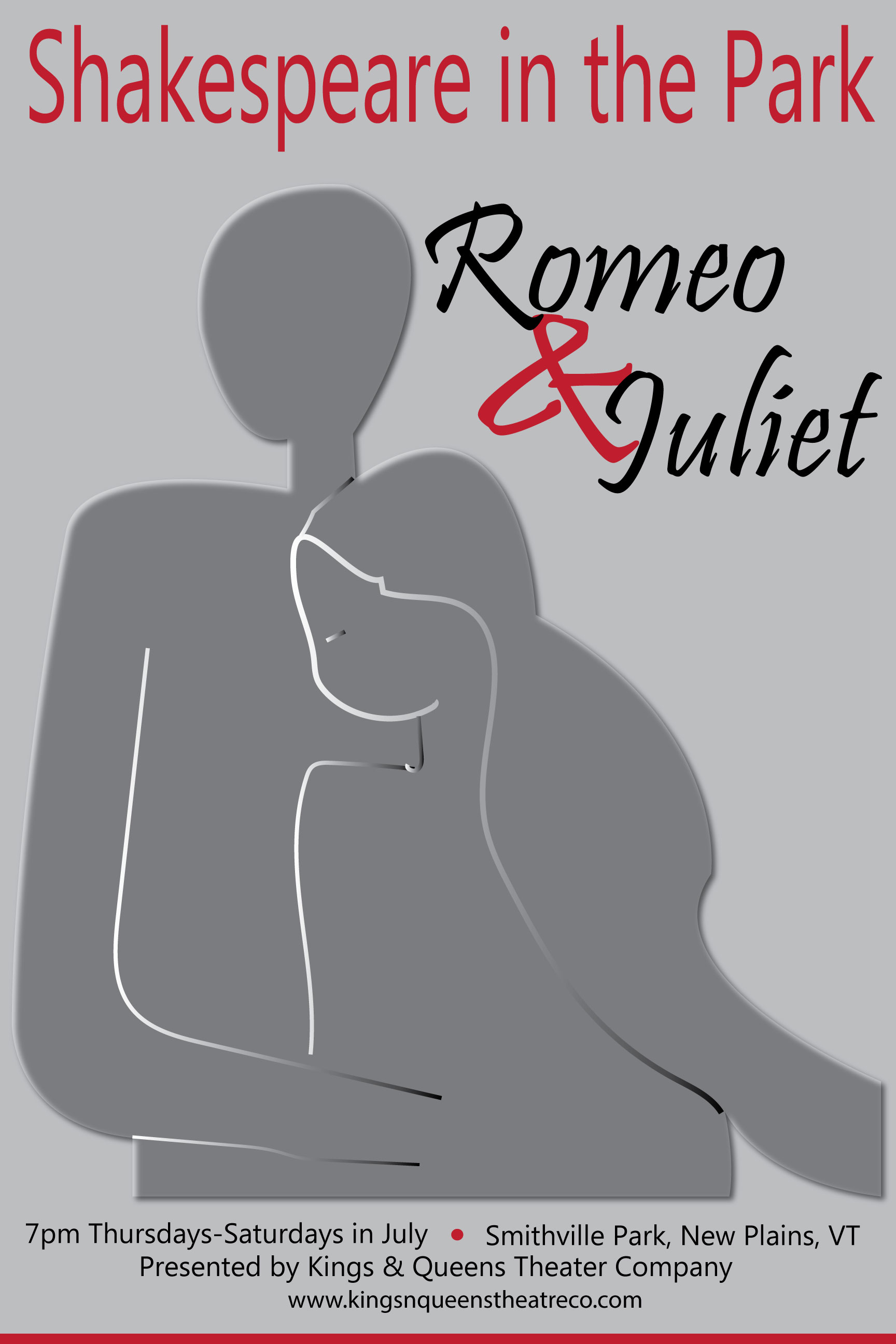
Here’s the one I handed in to be graded:
The goals to creating a successful visual identity are consistency, clarity, and communication. A company’s visual identity must be consistent, using the same design and logo throughout all its external communication methods from business cards to letterhead to its website. The design must be clear and easily identifiable. Use of color and line should represent the company’s vision, goals and product. This design is a pictorial communication with an audience, one that gets a message across quickly and clearly. It becomes an icon or symbol of that company, so that when someone sees it, they know what to expect.
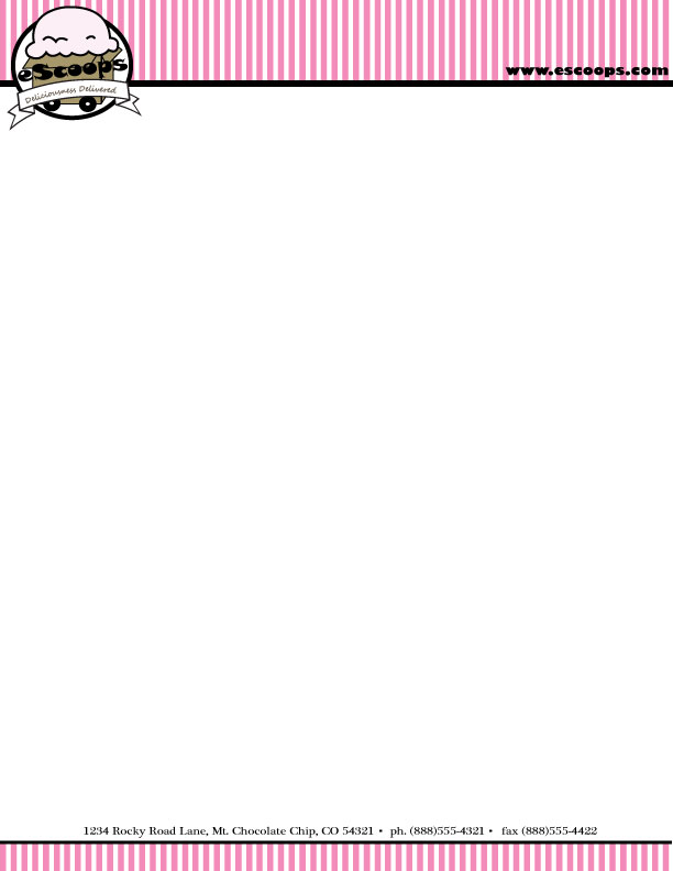
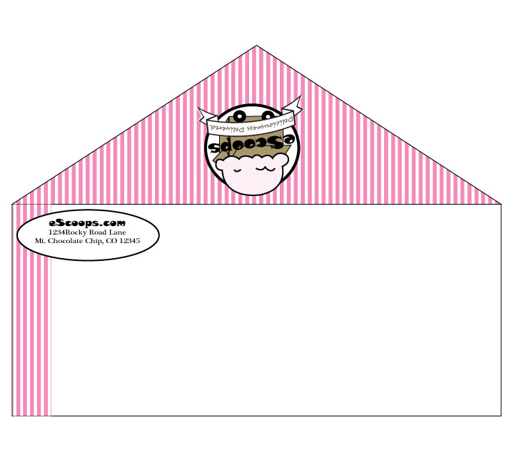
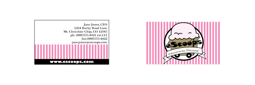
The Ice Cream Company “client” not only wanted a name and logo, but also stationery and business cards. In order to build a brand, all communication from the company must be complimentary. I decided the pink and white stripes would make great stationery, so I took the logo:
And built off the design to create letter head and envelopes:
And business cards (again incorporating the strips and the logo):
Our first project is to design a logo for a pretend client. We had three options to choose from, and I picked the online ice cream company, because I love ice cream! We have certain parameters given to us by the “client.” Here are my initial thoughts on the perspective design:
My Inspiration: There’s something nostalgic about ice cream. Somehow this creamy comfort food brings out the child in all of us. Kids old and young can be found licking rainbow sprinkles off their chocolate-vanilla twists. Because of this, the emphasis of the logo must be the ice cream. In terms of color, the “client” is limiting us to just three, so incorporating the trio of colors found in Neapolitan ice cream (pink, cream and light brown) seems appropriate.
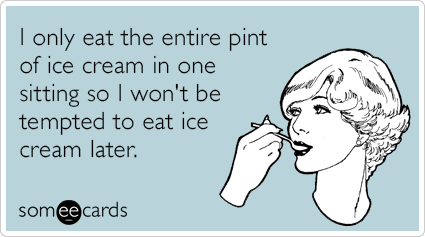
The light, pastel colors also give it an old-fashioned feel, like those SomeEcards that are floating around Facebook.
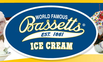
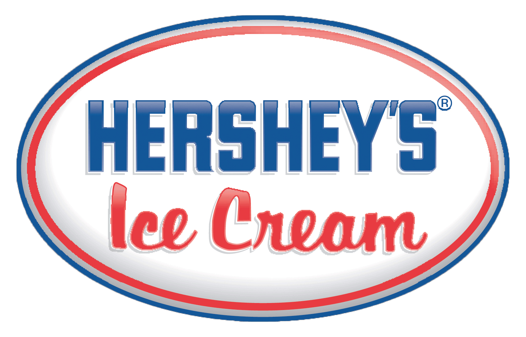
I found a number of ice cream companies with oval logos and script font. I’d like to continue the old-fashion theme with a similar font, like brush script or palace script. However, the client would like a rectangular-shaped logo.
In contrast to the old-fashioned theme, the consumer will order their ice cream online for home delivery. The “client” wanted to incorporate a shipping truck and once again nostalgia kicked in and I thought of the ice cream trucks from my childhood.
Another aspect the client requested in the logo is a box. A couple ice cream companies online show their insulated shipping container. However, for the logo design, perhaps a regular cardboard box may be better.


