It’s been a long time since I’ve posted something. So while I’m updating my portfolio, I found all these photos of my work in use. It’s always a thrill to see my design work being used by clients. Here are some photos of my work in real life!


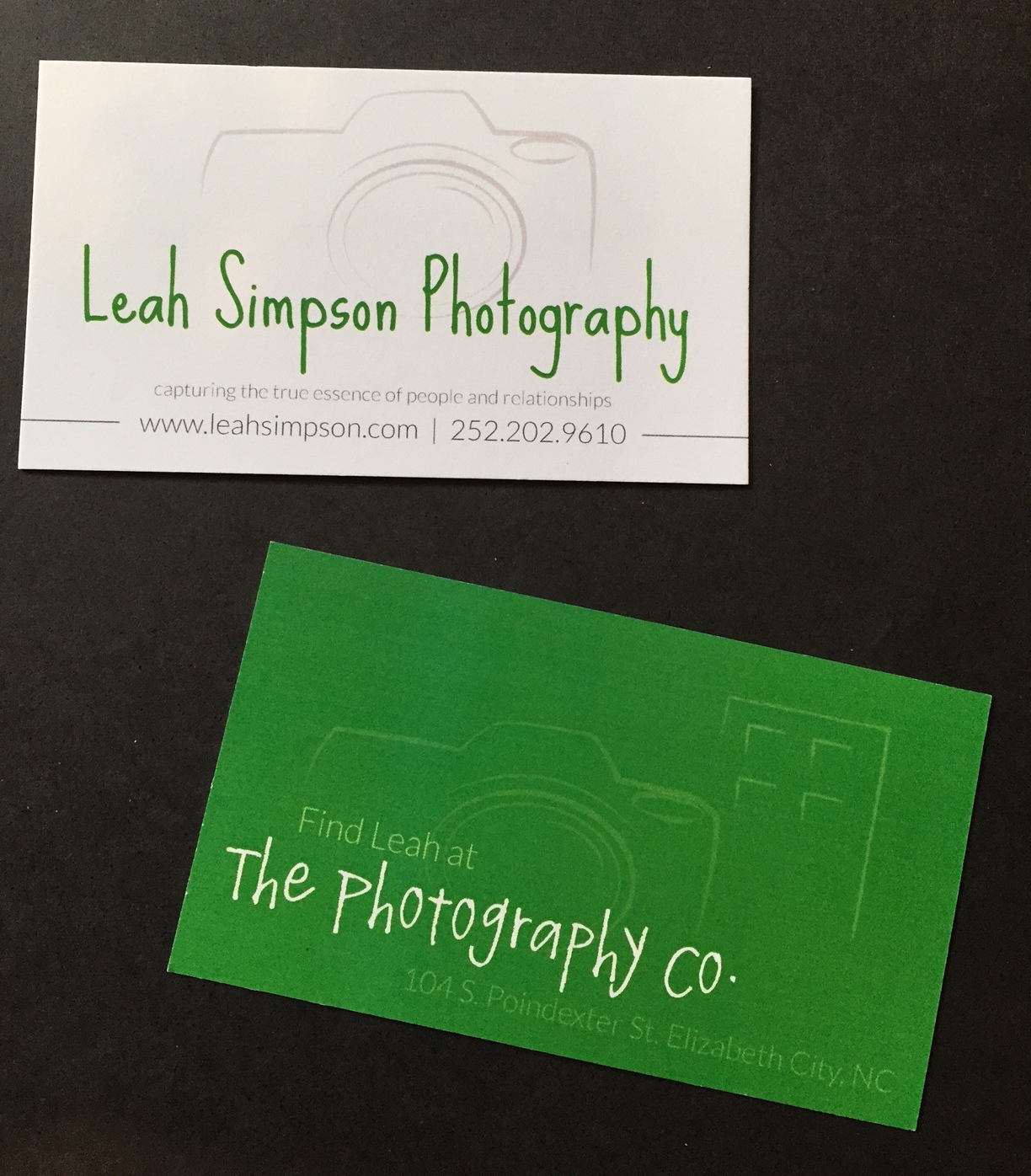
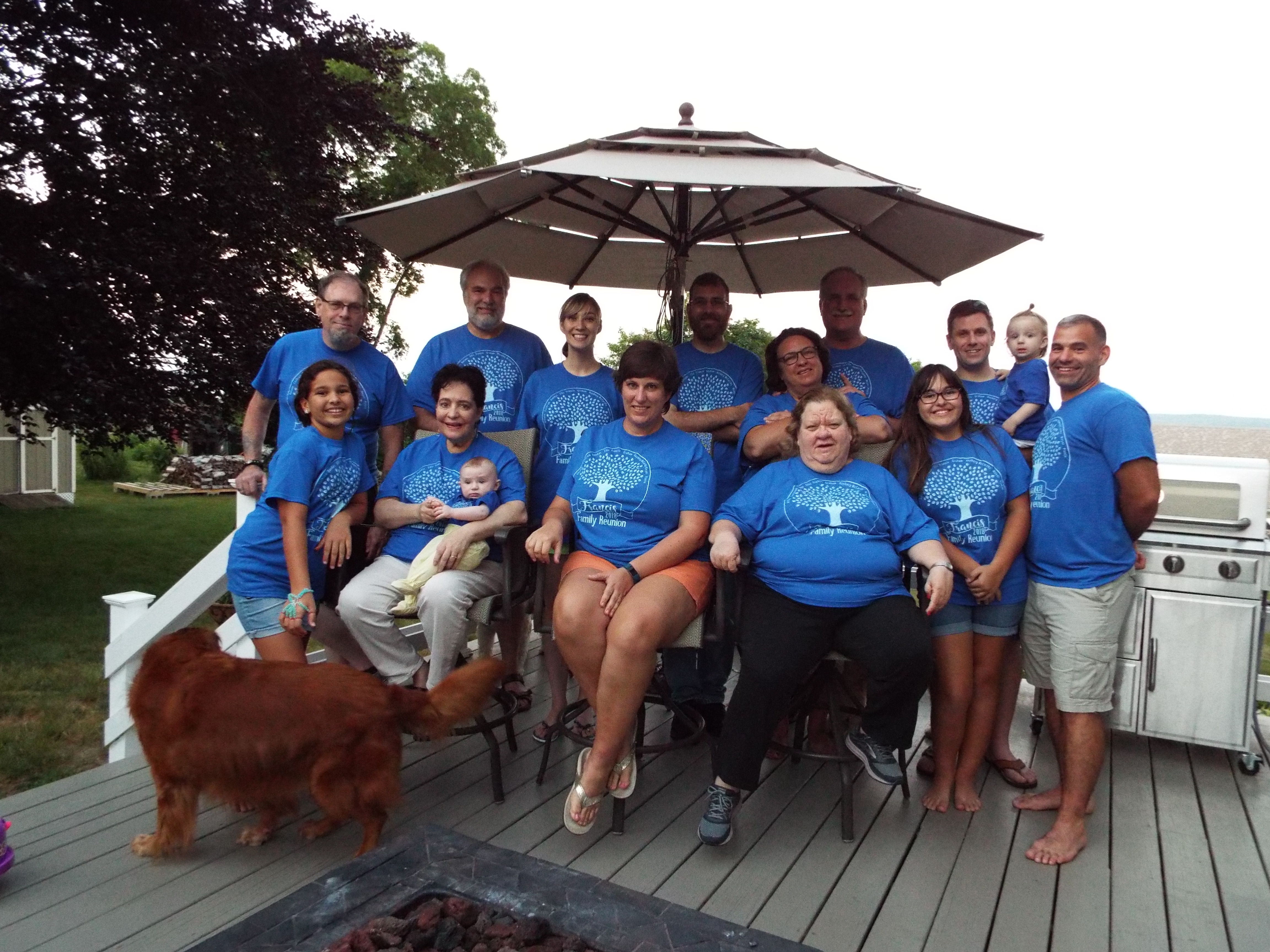


It’s been a long time since I’ve posted something. So while I’m updating my portfolio, I found all these photos of my work in use. It’s always a thrill to see my design work being used by clients. Here are some photos of my work in real life!
For this exercise, I edited a pre-designed Illustrator file, exported it to Photoshop and then applied various filters to the layers to get this effect:
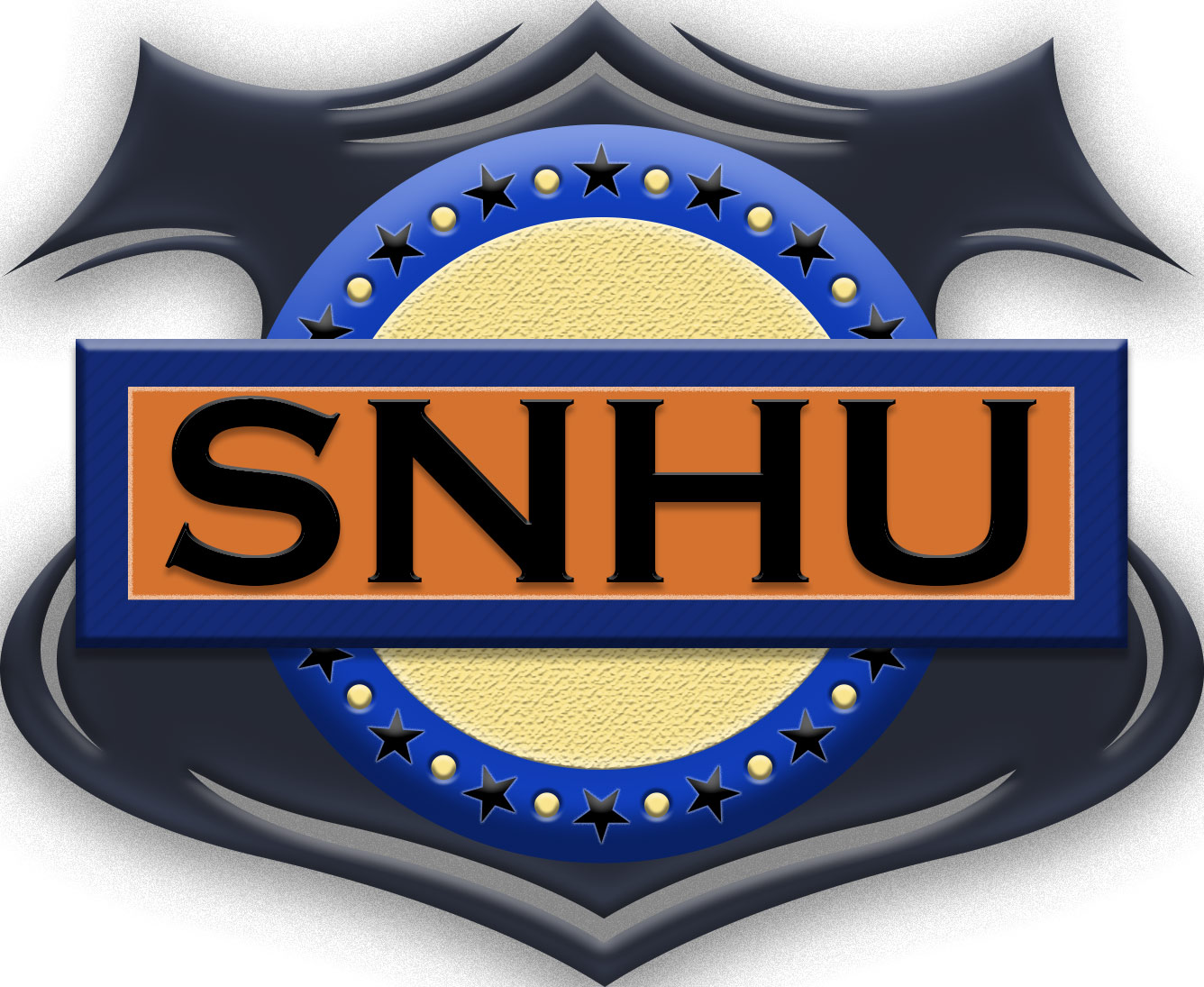
I used the bevel and emboss filter in various degrees to get the depth to this badge-like design. I also applied texture of the yellow circle and blue rectangle. The badge, blue circle and blue rectangle all have beveling filters as do the small yellow dots (but I adjusted the filter to have it look like the dots are pushed in).
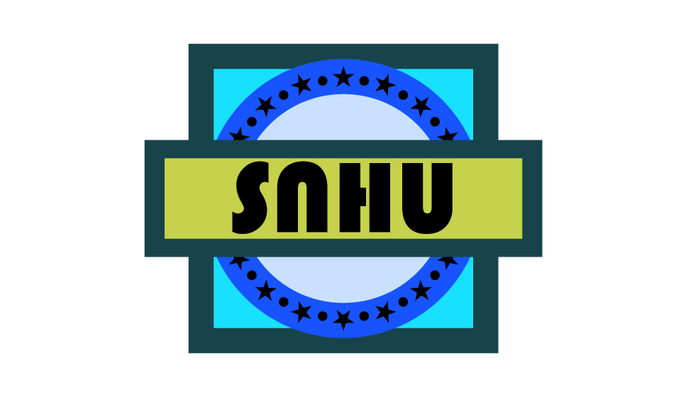
Here is the original, given to us by the instructor:
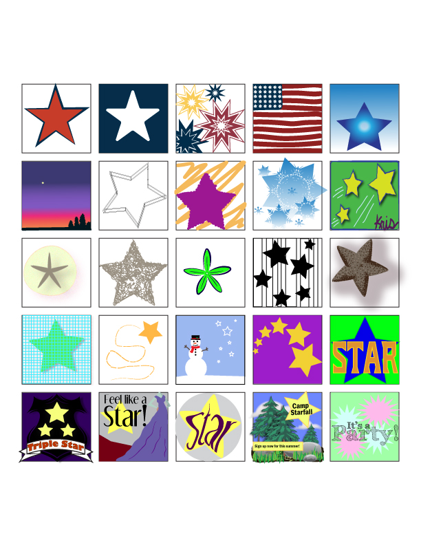
I used a star theme to keep a similar element to my 25 boxes (design in Illustrator):
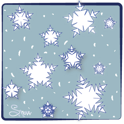
For this assignment we were asked to experiment with some of the basic tools in Illustrator: the pen, shape and brush tools. I started with a rounded cornered rectangle, filled it with color, and played with the stroke of the border. Then I used the shape tool to make stars of various sizes. I discovered the zigzag effect, which turned my stars into snowflakes! I used the drop shadow and outer glow filters on a few and used the brush tool to make white dots (snow in the background). I then used the text tool to add the word ‘snow.’
My first animated GIF! I wanted to do one with a background. It took me a couple tries, but I got it:
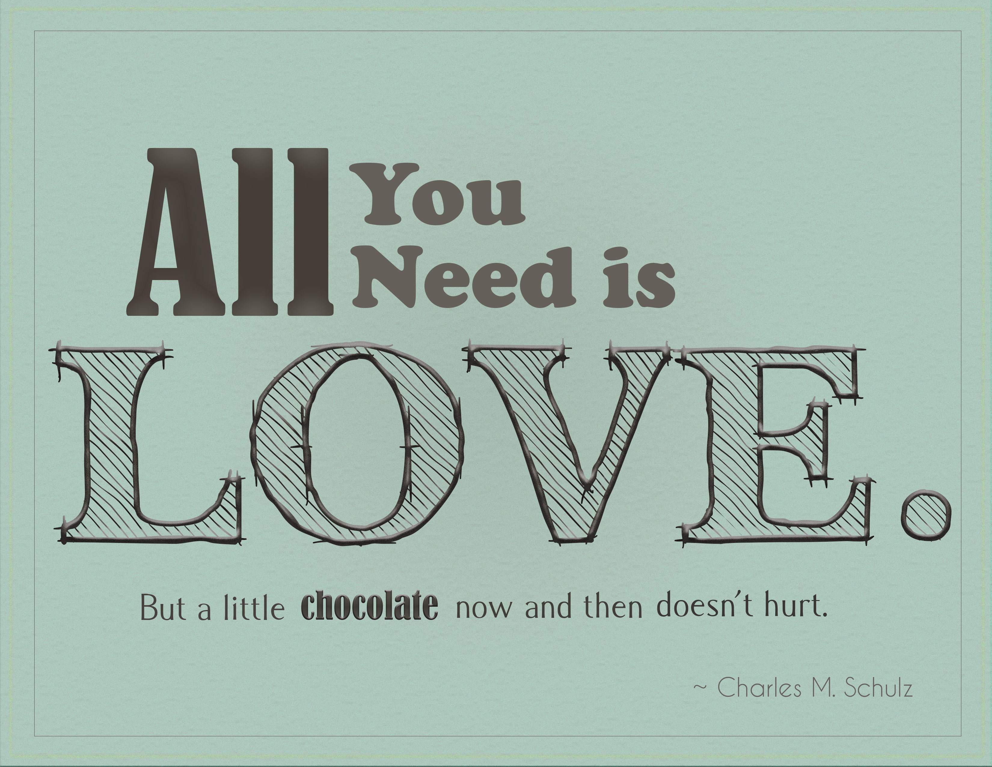 For this assignment, I wanted to do justice to the person who said it by creating a sweet tone with a partially hand-drawn look. I played around with filters until I had a textured background that had a worn appearance, like an old well-loved blanket. Since the quote pays homage to chocolate, I used brown for the font color. I made the first part of the quote prominent and the second more of an after thought. I used four fonts in the quote, but kept them similar (all serif). I applied filters (satin and embossed) to the words all, love and chocolate to add extra emphasis.
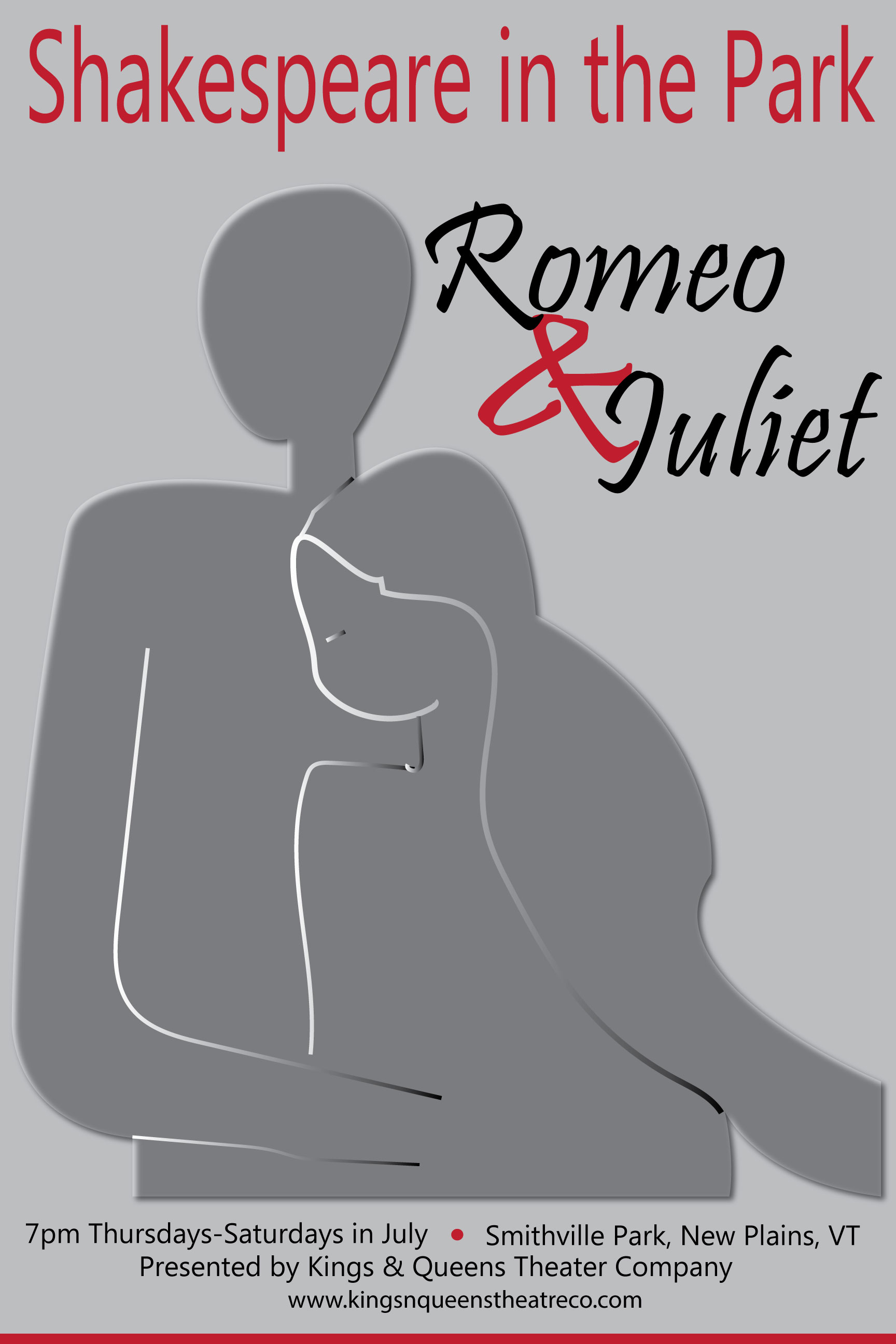
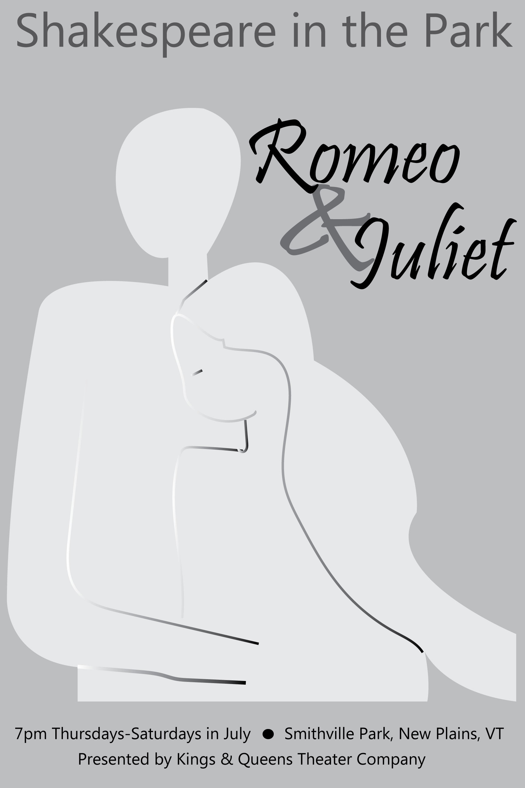
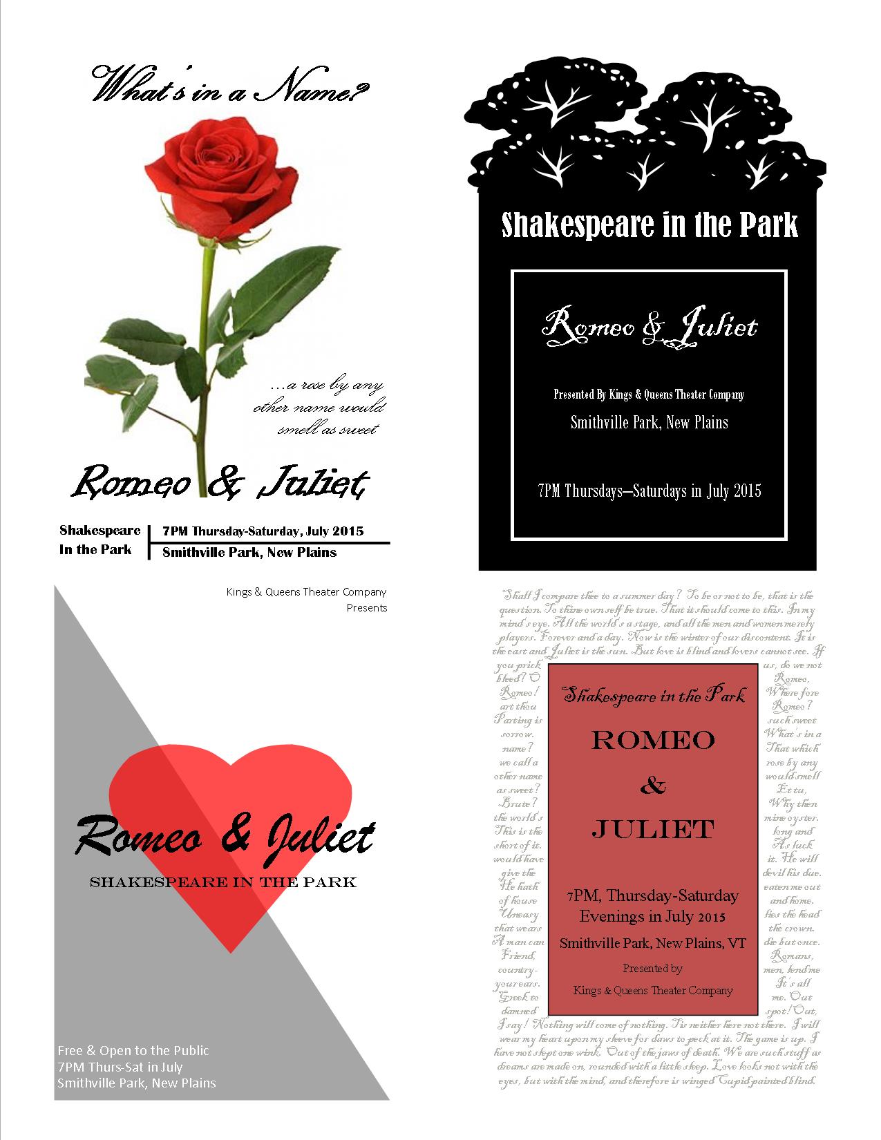
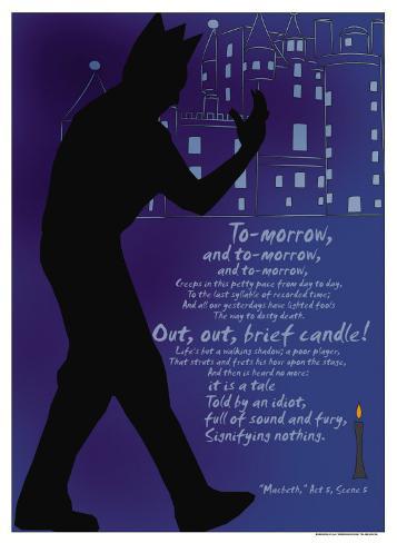
It was difficult deciding which sketch to make into my final poster. I decided to go with the silhouettes, mostly because I wanted to practice using the pen tool. I like the light and dark and the subtly of the people. I originally did not have any red, but the professor suggested using more contrast and color to make it more eye-catching.
Here’s the one I handed in to be graded:
According to Robin Landa in Design Solutions, a poster grabs a viewer’s attention with cooperation between image and type, interesting visualization and consideration of composition. A good composition must not only grab attention, but also set it apart from everything else out there that wants to be seen and communicate its key message clearly. To do this a designer must identify the message and the audience it’s trying to reach.
I played with a few different ideas with the Shakespeare posters – from a starry sky, to a lit balcony to a park. The sketch with “Montague vs. Capulet” was inspired by a boxing match poster. I tried to play up the light versus dark theme and to use some of the more famous lines from the play.

Since my handwriting is difficult to read, I did some mockups on some of the sketches, especially for the one in the bottom right corner (below). The background is quotes from Shakespeare’s plays. I did them in a script font in a light gray color, so they are mostly background, but a closer look and one can read all the greatest lines of several of his plays.
DESIGN BRIEF For Poster Project
Designer: Kristin Graham
Prepared By: Kristin Graham
Date: July 27, 2014
Project: Event Poster for Shakespeare in the Park
Size Specs: 24” x 36”
Client: Kings & Queens Theatre Company, New Plains, VT
Overview: A community theater company wants to advertise their Shakespeare in the Park Summer Play, Romeo & Juliet. They would like posters to hang in local businesses.
Design concept: The poster design will be vertical and reflect the theme of the play.
Audience: The target audience is teenagers and adults who like theater, especially Shakespeare, and/or families looking for summer evening outdoor entertainment.
Design Restrictions: The poster must grab the casual passerby’s attention and communicate the following information: title of the play (Romeo & Juliet), cost (free), time and dates (7:00pm Thursday through Saturday evenings in July 2015), and location (Smithville Park, New Plains, VT), as well as the theater company’s name (Kings & Queens Theatre Company), website (www.kingsnqueenstheatreco.com) and the director’s name (Anthony Stillwell).
Competition: There are so many others events going on in the summer that this poster must stand out and draw people in to see this play.
Takeaways: The audience should see this poster and know instantly that is advertising the play Romeo & Juliet. The design should reflect the theme or certain familiar aspects of the play (possibly the balcony, love, star-crossed, family feud). The information about the play (Shakespeare in the Park, date, time, location, etc.) should be clear and easy to find.
Advertising/Stores: The best places to hang this poster are in local shops and restaurants, especially those surrounding the park and those involved in the local Chamber of Commerce. Hanging the poster in shops and restaurants of neighboring towns would bring in people from a large geographic area. Other ideas for places to target are coffee shops, local colleges, libraries, museums and events bulletin boards.
Another recommendation is to contact the local newspaper to get the event listed on their calendar page.
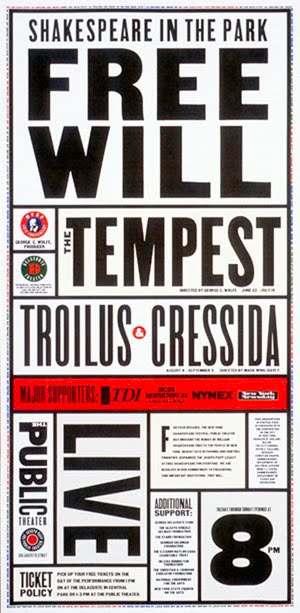
For our second class assignment, we were to chose one of three clients who needed a poster designed. One of the options was a poster for Shakespeare in the Park. I decided to focus on Romeo & Juliet for my Shakespeare in the Park poster (because it is the play I know best). The first idea that came to mind was the poster in our text book (figure 2-4, p. 23). I like the contrast, which also reflects the theme in R&J of light and dark. Another theme in much of Shakespeare is that things are not always what they seem, and this is reflected in the hidden images of the dagger and heart between the couple.

I like the combination of initials over the heart in the poster below and how the letters are not only connected, but the arm of the R is really a dagger (again, things are not always what they seem).

I was thinking about the star-crossed lovers bit and imagined a starry night, kind of like the poster below, but with stars instead of windows.

I like the idea of using a lit balcony as an isolated image in the middle of the page to determine the weight of the image (like figure 9-17 in our textbook).
But I also like the use of text as an image in the poster below to include some famous quotes from the play. Again, I like the high contrast between the text and the background. I also like the script typeface, which unites the individual words into one blended image.

However, considering my novice skills with Illustrator, a text-driven poster may be what I’m able to create at this point:
This poster seems to use the same type family and uses different sized text to emphasize and unite the information.
A poster of Shakespeare in the Park needs to convey the following information to the public: event title, play name, location, time, date, cost. The image used needs to help grab the viewer’s attention.
Here are some initial ideas/sketches:

Images Cited:
http://media-cache-cd0.pinimg.com/736x/a5/06/3e/a5063eb604ade096ed1ef76536ec0b14.jpg
http://payload.cargocollective.com/1/4/147536/1974360/rj%20cargo%20lg.jpg
http://imgc.allpostersimages.com/images/P-473-488-90/76/7605/VU2F300Z/posters/sonnet-18.jpg
The goals to creating a successful visual identity are consistency, clarity, and communication. A company’s visual identity must be consistent, using the same design and logo throughout all its external communication methods from business cards to letterhead to its website. The design must be clear and easily identifiable. Use of color and line should represent the company’s vision, goals and product. This design is a pictorial communication with an audience, one that gets a message across quickly and clearly. It becomes an icon or symbol of that company, so that when someone sees it, they know what to expect.
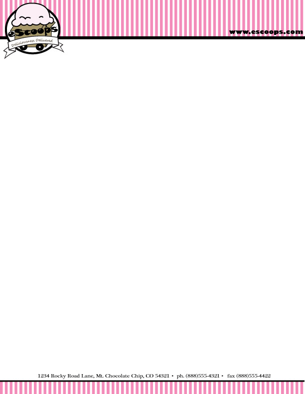
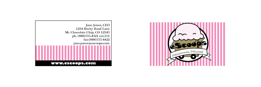
The Ice Cream Company “client” not only wanted a name and logo, but also stationery and business cards. In order to build a brand, all communication from the company must be complimentary. I decided the pink and white stripes would make great stationery, so I took the logo:
And built off the design to create letter head and envelopes:
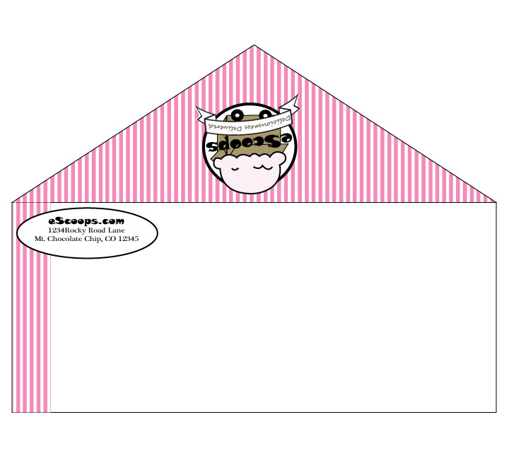
And business cards (again incorporating the strips and the logo):
