Poster Design Inspiration

For our second class assignment, we were to chose one of three clients who needed a poster designed. One of the options was a poster for Shakespeare in the Park. I decided to focus on Romeo & Juliet for my Shakespeare in the Park poster (because it is the play I know best). The first idea that came to mind was the poster in our text book (figure 2-4, p. 23). I like the contrast, which also reflects the theme in R&J of light and dark. Another theme in much of Shakespeare is that things are not always what they seem, and this is reflected in the hidden images of the dagger and heart between the couple.

I like the combination of initials over the heart in the poster below and how the letters are not only connected, but the arm of the R is really a dagger (again, things are not always what they seem).


I was thinking about the star-crossed lovers bit and imagined a starry night, kind of like the poster below, but with stars instead of windows.

I like the idea of using a lit balcony as an isolated image in the middle of the page to determine the weight of the image (like figure 9-17 in our textbook).

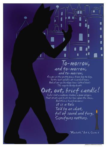
But I also like the use of text as an image in the poster below to include some famous quotes from the play. Again, I like the high contrast between the text and the background. I also like the script typeface, which unites the individual words into one blended image.

However, considering my novice skills with Illustrator, a text-driven poster may be what I’m able to create at this point:

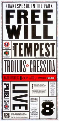
This poster seems to use the same type family and uses different sized text to emphasize and unite the information.

A poster of Shakespeare in the Park needs to convey the following information to the public: event title, play name, location, time, date, cost. The image used needs to help grab the viewer’s attention.

Here are some initial ideas/sketches:


Images Cited:

http://media-cache-cd0.pinimg.com/736x/a5/06/3e/a5063eb604ade096ed1ef76536ec0b14.jpg

http://payload.cargocollective.com/1/4/147536/1974360/rj%20cargo%20lg.jpg

http://imgc.allpostersimages.com/images/P-473-488-90/36/3633/SEMEF00Z/posters/christopher-rice-macbeth-out-out-brief-candle.jpg

http://imgc.allpostersimages.com/images/P-473-488-90/76/7605/VU2F300Z/posters/sonnet-18.jpg


Ice Cream Company Logo & Stationery

The goals to creating a successful visual identity are consistency, clarity, and communication. A company’s visual identity must be consistent, using the same design and logo throughout all its external communication methods from business cards to letterhead to its website. The design must be clear and easily identifiable. Use of color and line should represent the company’s vision, goals and product. This design is a pictorial communication with an audience, one that gets a message across quickly and clearly. It becomes an icon or symbol of that company, so that when someone sees it, they know what to expect.

The Ice Cream Company “client” not only wanted a name and logo, but also stationery and business cards. In order to build a brand, all communication from the company must be complimentary. I decided the pink and white stripes would make great stationery, so I took the logo:

eScoops

And built off the design to create letter head and envelopes:

letterhead envelope

And business cards (again incorporating the strips and the logo):

biz-cards

Mock-ups of Ice Cream Company Logo

From the 12 thumbnail sketches of the logo design, I narrowed it down to three that best fit the client’s requirements for the logo: it must contain a box, a truck and ice cream and only be three colors.

JubileeJubilee Gourmet Ice Cream Shipped with a Cherry on Top!

In the original sketch, I named this Dip & Ship, but I played with the “cherry” tagline and came up with Jubilee. I liked the tagline and the design incorporated everything the clients wanted. I made the box into a truck with a scoop of ice cream coming out of it. The cardboard box is conveniently the same color as a ice cream cone. And, there is of course, a cherry on top!  This logo could easily be printed as a sticker to be put on boxes or made into magnets with the website address for reordering.

CowLicksCow Licks: From Our Farm To Your Freezer

This Logo didn’t have a box, but I liked the idea of the ice cream coming straight from the farm and playing with the idea even more with cow print on the truck. Again, I put a scoop of ice cream on top of the truck and designed the name to fit into the scoop.

eScoopseScoops: Deliciousness Delivered

I liked this design best. It incorporated everything the client wanted and had the nostalgic feel I was going for. The pink and white stripes in the background, not only reflect vanilla and strawberry ice cream, but look like wallpaper one might find in an old-fashioned ice cream parlor. Here again I used the box/truck with a scoop of ice cream coming out of it. I had another version of this that I liked better, but it didn’t have the box/truck that the client wanted:

escoops2

Logo Sketches & Design Brief

KGraham_LogoSketches

Thumbnail Sketches

The second step in this design assignment was to sketch 10 different logo ideas. This was challenging considering the constraints from the “client” (use only three colors; include a truck, a box and ice cream). As a firm believer in brainstorming, I thought outside the box and let my imagination wander. I really liked the Aloha Ice Cream sketch, but it wasn’t even close to what the “client” wanted. I played with the Neapolitan trio-colors, the nostalgic old-fashioned ice cream parlor, and a few fun names and taglines. It would help to know more about the personality and product of the company. What distinguishes them from the competition?


DESIGN BRIEF for Ice Cream Company Logo


Designer: Kristin Graham

Prepared By: Kristin Graham

Date: July 13, 2014

Project: Company Name, Logo, Stationery

Client: Online Ice Cream Company

Overview/Concept: An ice cream company is launching an online business. Costumers will be able to order ice cream online and it will be shipped to them. This is the old concept of “ice cream in a box.” The name of the company and logo must reflect the concept of shipping ice cream.

Consumers/Audience: This company will attract fans of their specific ice cream, connoisseurs of ice cream, and people who live in remote areas where good quality ice cream may not be easily available. Since shipping costs are high (overnight shipping is required to keep ice cream from melting, as is the customer being home to accept delivery), so the average customer will need to be willing to pay more than they would at the grocery store for ice cream. Uniqueness in ingredients and flavors will attract customers and distinguish them from the competition.

I don’t think many people know about buying ice cream online, unless they have visited a local shop and have seen an advertisement about shipping. They may be interested in having the ice cream shipped home to enjoy with family and friends, thus possibly increasing the customer base or to send as a gift.

Design Restrictions: The client would like a logo that includes a shipping truck, box and ice cream using only three colors. The logo must be inside a taller rectangle. The logo should indicate the company’s objective: to ship ice cream.

Competition: There are a number of online ice cream companies. At eCreamery.com, customers can customize their flavors and packaging to create a unique ice cream. Graeter’s and Bassetts, as well as New Orleans and Boulder Ice Cream companies, sell their pints online for purchase, increasing their customer base outside their immediate geographic area. Jeni’s Splendid Ice Cream and Raw Ice Cream Company specialize in ingredients that appeal to those who eat a specific kind of diet.