
Category: Uncategorized
The best is yet to come
I’ve started another course towards my graphic design degree and will be making some modifications to this blog as part of that class. Stay tuned to see what’s coming!
Lately
I’m finishing up the last couple weeks of my third round of graphic design courses. Although I’ve enjoyed taking a photography class this term, I’ve realized it is not my strength. I much prefer print design, which goes along with my recent project: a branding campaign for my church (examples can be found in the portfolio section). I’m learning yet another program in the Adobe Creative Suite: Photoshop. It’s very complicated – and frustrating for me – because every element has it’s own layer, but I’ve already put my new photo editing skills to work on touching up our family Christmas card picture!
Checking in
This week wraps up my second term of graphic design classes. It was a challenge to my time management skills to juggle two classes this term, but I loved every minute of it! I realize that this is what I want to be when I grow up! And that’s a good feeling!
One of my classes was on desktop publishing. I learned a new computer program and created a magazine cover, tri-fold brochure, four-page newsletter and children’s book cover (of course, I made a cover for my mermaid book)!
In the other classes I learned about the language and practice of media arts! It was all about storyboarding, lighting, camera angles, sounds, and analyzing commercials. For my final project I created a script for a 30-second commercial for a non-profit organization!
I have next week off and then start another round of classes! I’ll post some of my projects in the portfolio section of this blog.
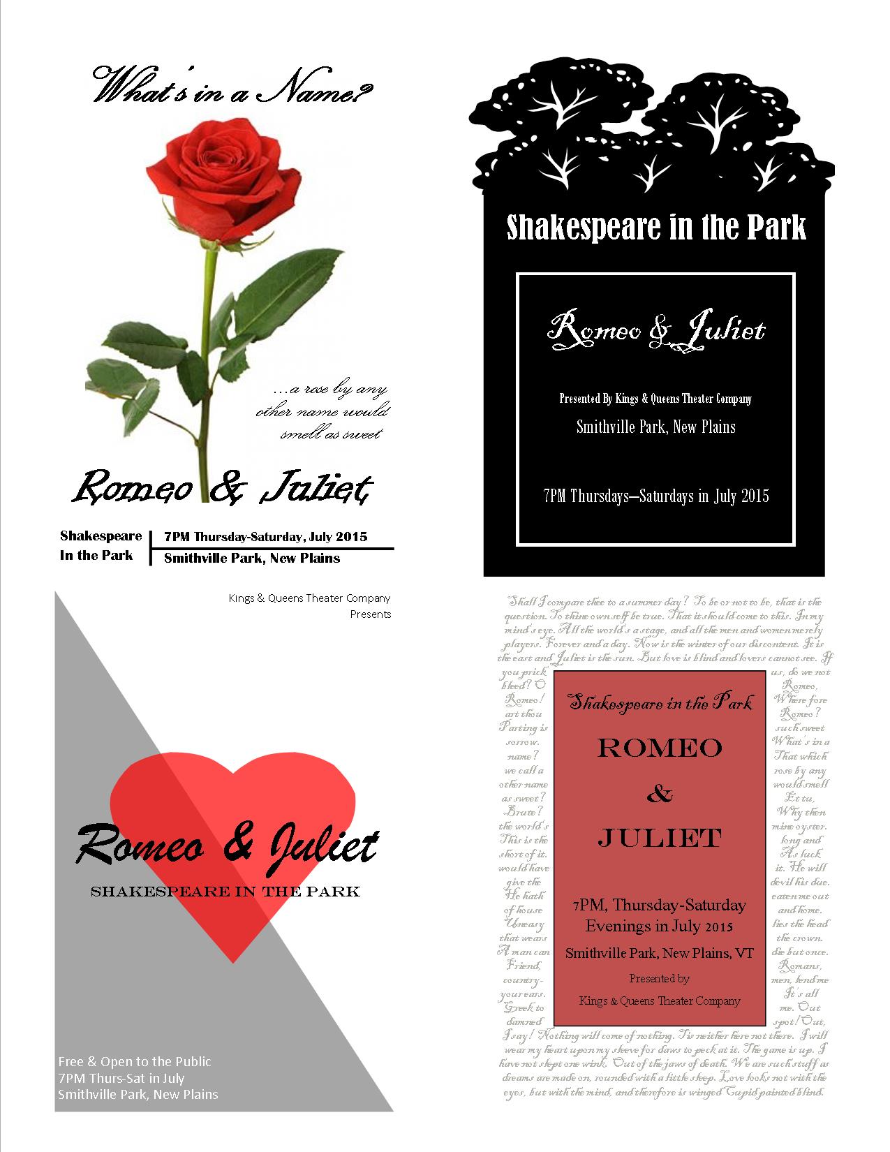
Poster Thumbnail Sketches & Design Brief
According to Robin Landa in Design Solutions, a poster grabs a viewer’s attention with cooperation between image and type, interesting visualization and consideration of composition. A good composition must not only grab attention, but also set it apart from everything else out there that wants to be seen and communicate its key message clearly. To do this a designer must identify the message and the audience it’s trying to reach.
I played with a few different ideas with the Shakespeare posters – from a starry sky, to a lit balcony to a park. The sketch with “Montague vs. Capulet” was inspired by a boxing match poster. I tried to play up the light versus dark theme and to use some of the more famous lines from the play.

Since my handwriting is difficult to read, I did some mockups on some of the sketches, especially for the one in the bottom right corner (below). The background is quotes from Shakespeare’s plays. I did them in a script font in a light gray color, so they are mostly background, but a closer look and one can read all the greatest lines of several of his plays.
DESIGN BRIEF For Poster Project
Designer: Kristin Graham
Prepared By: Kristin Graham
Date: July 27, 2014
Project: Event Poster for Shakespeare in the Park
Size Specs: 24” x 36”
Client: Kings & Queens Theatre Company, New Plains, VT
Overview: A community theater company wants to advertise their Shakespeare in the Park Summer Play, Romeo & Juliet. They would like posters to hang in local businesses.
Design concept: The poster design will be vertical and reflect the theme of the play.
Audience: The target audience is teenagers and adults who like theater, especially Shakespeare, and/or families looking for summer evening outdoor entertainment.
Design Restrictions: The poster must grab the casual passerby’s attention and communicate the following information: title of the play (Romeo & Juliet), cost (free), time and dates (7:00pm Thursday through Saturday evenings in July 2015), and location (Smithville Park, New Plains, VT), as well as the theater company’s name (Kings & Queens Theatre Company), website (www.kingsnqueenstheatreco.com) and the director’s name (Anthony Stillwell).
Competition: There are so many others events going on in the summer that this poster must stand out and draw people in to see this play.
Takeaways: The audience should see this poster and know instantly that is advertising the play Romeo & Juliet. The design should reflect the theme or certain familiar aspects of the play (possibly the balcony, love, star-crossed, family feud). The information about the play (Shakespeare in the Park, date, time, location, etc.) should be clear and easy to find.
Advertising/Stores: The best places to hang this poster are in local shops and restaurants, especially those surrounding the park and those involved in the local Chamber of Commerce. Hanging the poster in shops and restaurants of neighboring towns would bring in people from a large geographic area. Other ideas for places to target are coffee shops, local colleges, libraries, museums and events bulletin boards.
Another recommendation is to contact the local newspaper to get the event listed on their calendar page.
