The goals to creating a successful visual identity are consistency, clarity, and communication. A company’s visual identity must be consistent, using the same design and logo throughout all its external communication methods from business cards to letterhead to its website. The design must be clear and easily identifiable. Use of color and line should represent the company’s vision, goals and product. This design is a pictorial communication with an audience, one that gets a message across quickly and clearly. It becomes an icon or symbol of that company, so that when someone sees it, they know what to expect.
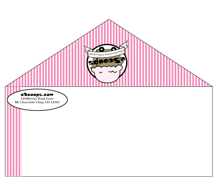
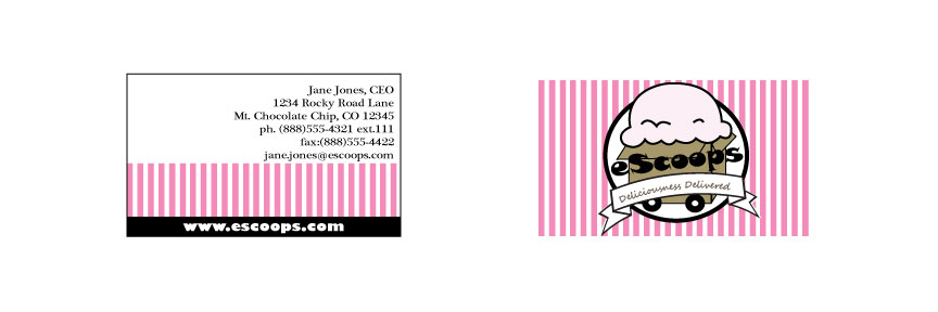
The Ice Cream Company “client” not only wanted a name and logo, but also stationery and business cards. In order to build a brand, all communication from the company must be complimentary. I decided the pink and white stripes would make great stationery, so I took the logo:

And built off the design to create letter head and envelopes:

And business cards (again incorporating the strips and the logo):

You really nailed the Logo & Stationery Design project for the course. Best I have seen so far on all of the blogs.
LikeLike
Thanks so much!
LikeLike